How to Visualize IT and Software Services?
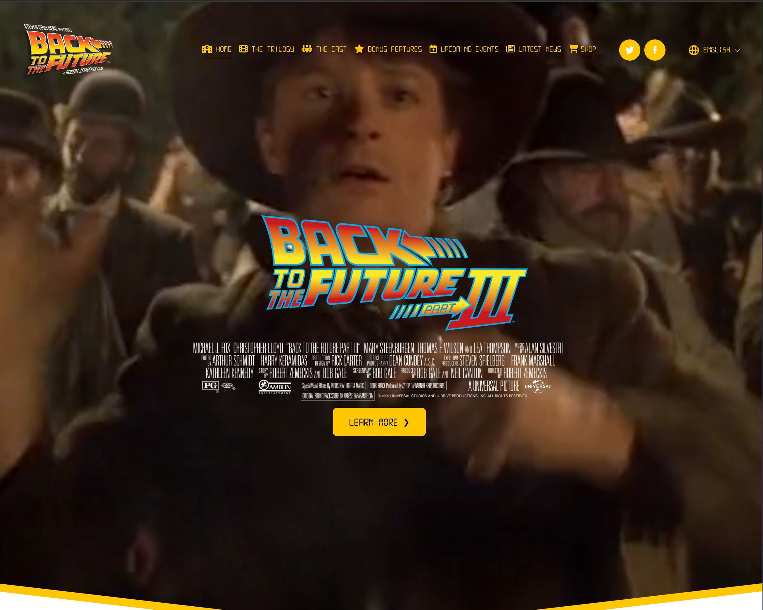
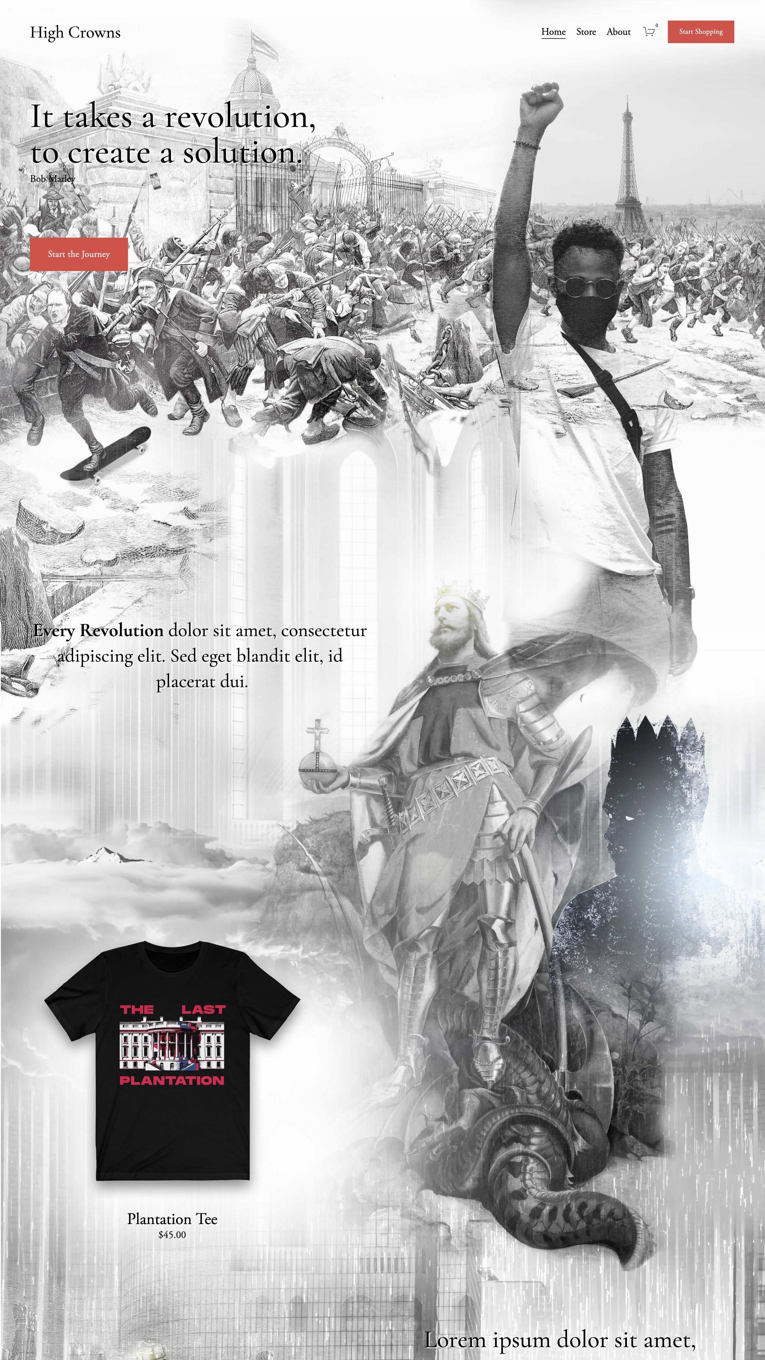
Braunsberger Media specializes in marketing for IT and Software brands. Our design services address a significant challenge in the industry. Unlike many sectors that can easily showcase their products or services through straightforward imagery, the IT and software branch often struggles to visually represent their complex and abstract offerings. This is where Braunsberger Media steps in.
We offer a unique blend of strategic consulting and advanced visual skills to create images that are both realistic and metaphorical, tailored specifically for the IT and Software sector - often with a human touch. Our expertise in image composing enables us to craft banner images that go beyond mere decoration, serving as a vital tool in conveying the intricacies of our client's services. These images are versatile and can be utilized across various platforms and materials, including websites, presentation documents, covers, keynotes, and promotional materials.
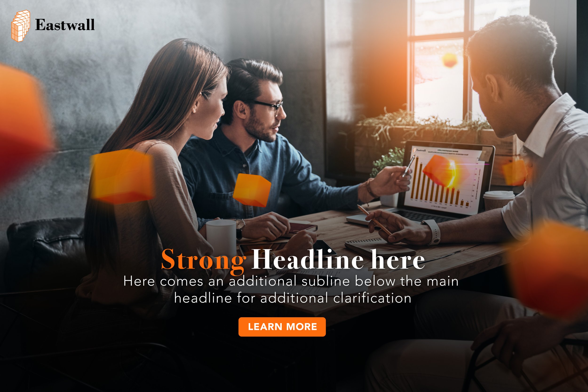
Case: Eastwall (US)
Denver-based, established IT consulting and service firm and Microsoft Partner specializing in Cloud, Azure, Compliance, and Applications
In developing a series of website banner images, our focus was on visually representing our client's consulting excellence. The client's logo, characterized by its cube design, served as the foundation for our concept. We expanded this idea by incorporating 3D cubes into the imagery to reflect the modular and agile nature of the client's services.
These 3D cubes were designed to symbolize the adaptability and flexibility inherent in agile consulting practices. Each cube, through its unique size and orientation, represents the various components of the client's services, emphasizing the ability to customize solutions based on client needs.
Our approach was to create visuals that clearly communicate the idea of modularity and agility in a straightforward manner. The banner images were intended to reinforce the client's brand identity while illustrating their commitment to providing dynamic, client-focused consulting services. Through the strategic use of 3D cubes, the imagery connects the concept of agile services with the visual identity of the client, offering a clear, visual representation of their service approach.
eCommerce Home Delivery Visual Concept
Case: Lapis (CH)
About: LAPIS is a designed proprietary system that controls access and monitors crowd flows using check-in points
and predetermined limits on public gatherings for events, parks, beaches, and any place where crowds might gather.LAPIS provides operational support to municipalities, control agencies and other involved parties when emergencies
occur an strengthens their emergency management activities.
Case: Sentinel Resource Group (US)
SRG pioneered an innovative approach to security risk management. Using a cross-disciplinary team of experts, enabled with industry-leading technologies, SRG helps clients clarify their security risks, to better protect their people, workplaces, and assets.
In the design of several banner images, we introduced the innovative concept of an "invisible shield" to visually represent the reliability and trustworthiness of our client's services. This abstract idea was brought to life through subtle visual cues and imagery that suggest protection and security, without overtly depicting physical barriers.
Overall,incorporating the "invisible shield" concept, alongside the use of the client’s corporate colors: blue and orange hues, resulted in banner images that effectively communicate the essence of our client's trustworthy services, while also standing out for their visual sophistication and conceptual depth.
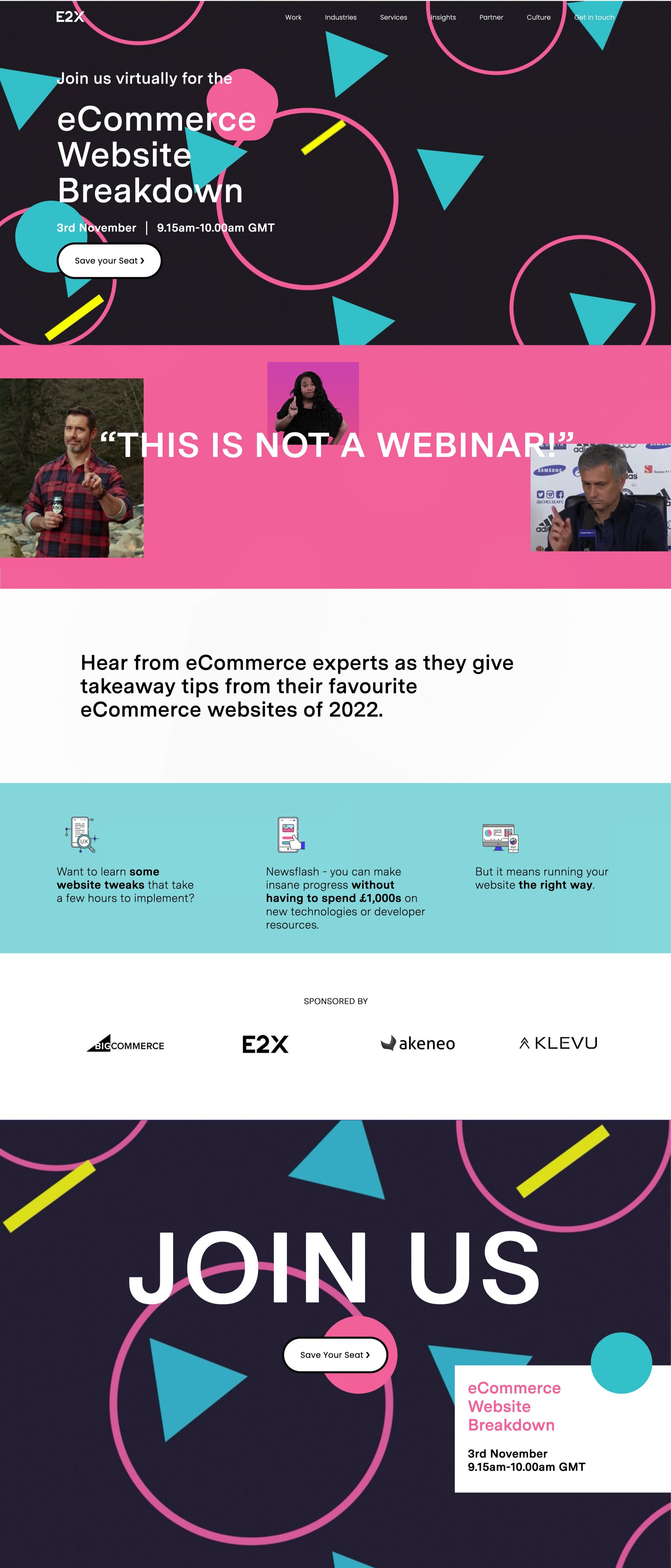
Case: E2X (UK)
We collaborated on many website projects with the UK-based (now part of the Apply Digital family) technology and eCommerce specialist E2X.
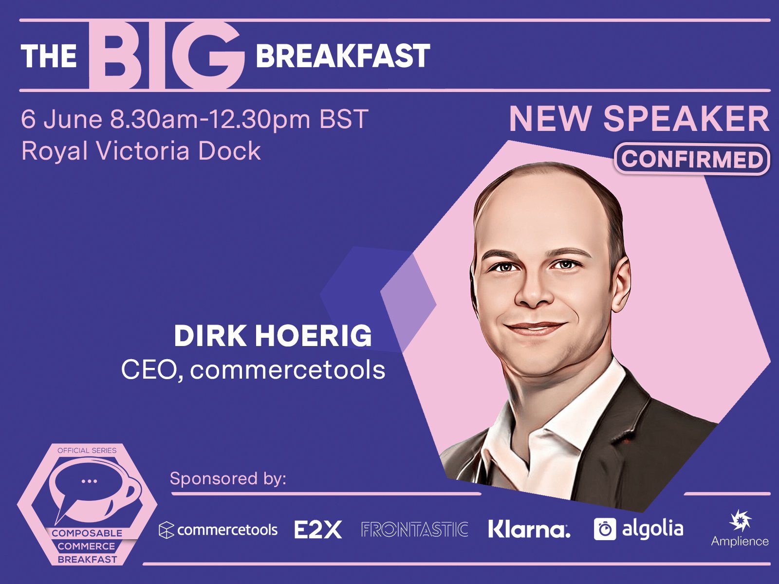
We developed several website iterations, along with bespoke landing pages tailored for both physical and virtual events. Additionally, we created Photoshop banners designed to visually interpret the constantly shifting IT landscape, strategically positioning E2X as a seasoned leader within the industry.
Case: Vital Core (US)
A unique company that acquires entire teams of talent and IT assets from global organizations, MSPs, and datacenter operators.
During the website development phase, we designed a comprehensive set of branded banner images, each strategically tailored for deployment across all critical areas of the website. These bespoke banners were crafted to not only align with but also amplify the website's aesthetic and thematic coherence.
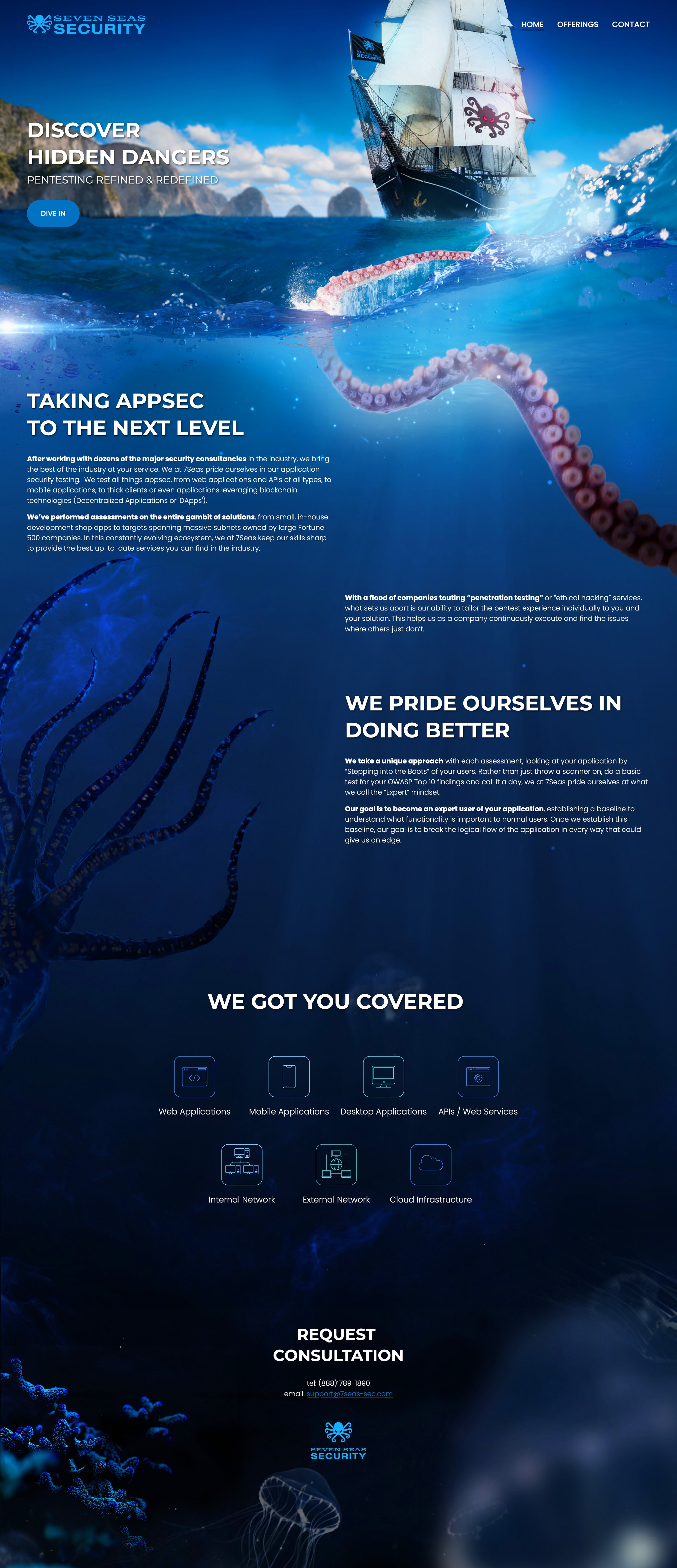
Case: Seven Seas Security (US)
Seven Seas Security tests all things appsec, from web applications and APIs of all types, to mobile applications, to thick clients.
In our discussions with the client, it became clear that the core theme revolved around "hidden dangers". To creatively address this, we decided to evolve their existing brand logo into a captivating pirate-themed narrative. This concept depicted a ship courageously navigating through perilous waters, symbolizing the client's adeptness in steering through the complexities of their industry. To bring this vision to life, we skillfully blended multiple stock images, crafting a visually compelling one-pager. This not only served as an engaging introduction to their services but also intricately conveyed the essence of navigating through challenges with expertise and foresight.


